
About the Project
The client needed a renewed business cardbrand identity to improve communication and outreach across their platforms. The project focused on developing a professional voice and tone that communicates the company’s energetic spirit, spiritual foundation, and trusted presence.
A memorable main logo, logo mark, and letterform.
2 Product Mockups
6 Cohesive Icons to use in merchandising.
Deliverables
Version 1
2025
***I do not own the header image or any images sourced from Pinterest. All rights belong to their respective creators.
Brand Logo
The logo serves as the cornerstone of the visual identity system — a mark conceived to embody hope and aspiration. A deliberate tension between organic curves and precise geometric linework communicates both maturity and approachability, grounding the brand while preserving its calm, uplifting character.
Main Logo

Logo Mark
Typography
The brand utilizes Fisterra Morte and Poppins to strike a balance between personality and readability. Fisterra Morte serves as the primary display typeface, adding character and emotional weight to headlines. Poppins provides clean, versatile support, with Regular for body text and Light Italic for annotations and secondary notes. Together, they create a cohesive system that reinforces the brand’s tone while maintaining clarity across platforms.

1.

2.

Colors
The New Heaven color palette is designed to support the brand’s soft, whimsical identity. Primary hues consist of gentle blues and off-white tones, chosen to create a calm, inviting atmosphere that evokes wonder. These colors establish the brand’s emotional foundation and should be used consistently across core applications.
Accent colors provide flexibility and visual variety while remaining closely tied to the brand’s central themes. They are intended to complement the primary palette, adding depth and interest without overwhelming the overall aesthetic.
1.
HEX: 525691
RGB: 82, 86, 145
HEX: 4484D8
RGB: 68, 132, 216
HEX: 7599D9
RGB: 117, 153, 217
HEX: DADFE5
RGB: 218, 223, 229
HEX: E35B0D
RGB: 227, 91, 13
2.
HEX: C33F3F
RGB: 195, 63, 63
HEX: FD547D
RGB: 253, 84, 125
HEX: C2BB8E
RGB: 194, 187, 142
HEX: BDCB70
RGB: 189, 203, 112
HEX: 59704B
RGB: 89, 112, 75
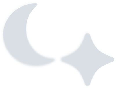
Icons
Six supporting assets extend the identity across branded merchandise, reinforcing the brand's call to action: "Dream beyond the ordinary." Each asset shares a unified shape language and a signature fade along the lower edge. This is a deliberate stylistic choice that defines the brand's atmospheric quality.
Assets must be used as provided, scaled proportionally, and with the fade treatment preserved. Cropping or hardening the edge disrupts both visual consistency and the intended aesthetic.


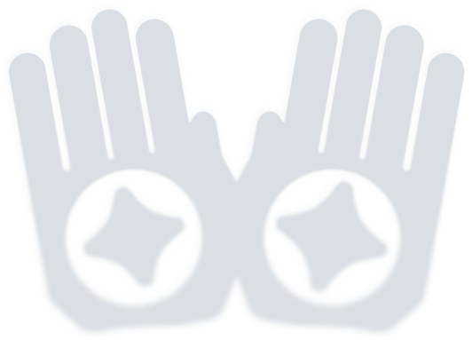

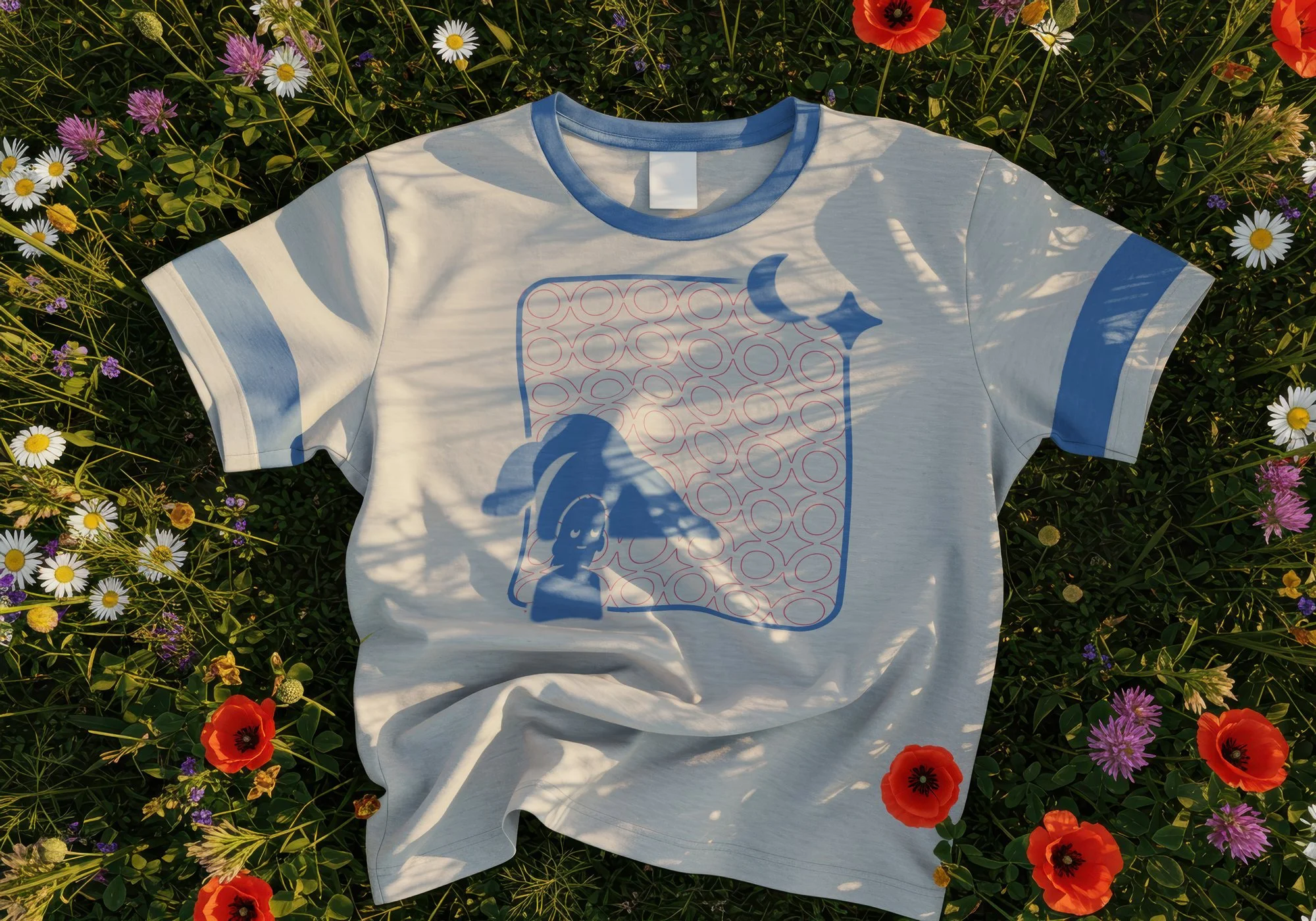
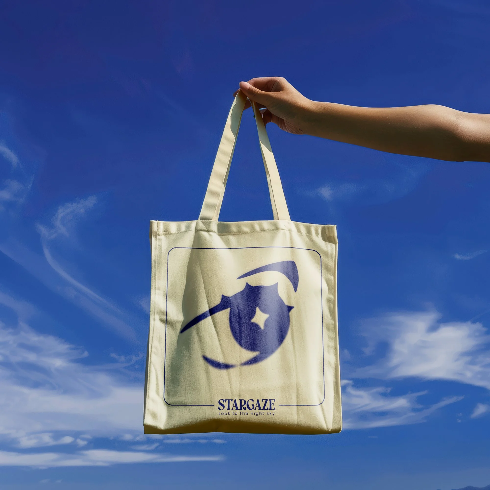
Application
These two mockups demonstrate the application of brand icons on printed merchandise. The T-shirt and tote bag are designed to appeal to younger and older audiences, respectively, while maintaining a consistent visual language. Both applications reflect the brand’s lighter, atmospheric themes and illustrate how the icons translate across different materials and formats.